Most of what I do on the computer is in a terminal window. I actually bring up gvim to write my sermons, but unless you’re in the trade, you wouldn’t see the difference. The point is that less and less do I use fancy graphical interfaces with fonts and so forth to do my work. More and more do I regress back into the comfortable 80×24 existence of my tender years. (Except I prefer something more like 80×35 or 80×40, if I can get it.)
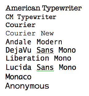
Terminal windows require a monospaced font. Monospaced fonts are fonts where each letter takes up the same amount of room: a capital I and a lowercase w are equally wide. Here are some examples:
The problem is that most of them don’t work so well. Some are just wrong. For example, Courier New is too spindly to be of any use at all. Others make terminal.app crazy (DejaVu and Liberation, I’m looking at you). So mostly, I use “Monaco” or “Lucida Sans Typewriter”. The problem with those is they aren’t really programmer fonts: they don’t help you distinguish between ambiguous glyphs like lowercase L and 1, or capital O and zero (0), like this:
Plus, every programmer worthy of the name wants their typewriter text to look typewriter-y. I used to think this was to be like K&R (Courier), but later on I realized it was to be like Knuth (CM Typewriter).
Anyway, a couple of years ago, I stumbled onto profont, which seemed like it was exactly what I wanted. But it wasn’t.
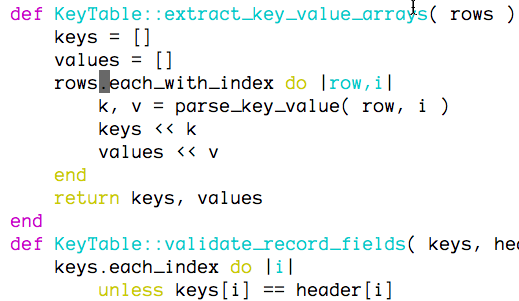
Today, I found Anonymous. Behold:
Light but not spindly. No way to confuse your ones and L’s. Oh, joy! Raptures!

